
Why You Can't Choose Decorative Paint From a Color Card: Sample Boards vs AI Paint Visualizer
By Curtis (RoomDreaming Editor)
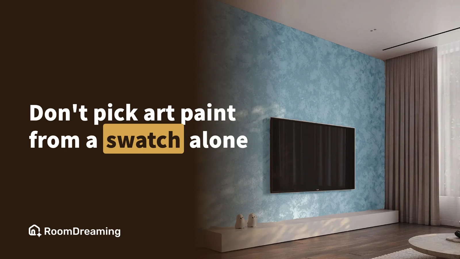
What a decorative paint looks like on the wall depends on three things — the color, the application technique and the light. A small color card only shows you the first one. The most efficient order: visualize it on a photo of your own wall, narrow it down to two or three, and only then make physical sample boards.
Decorative paints — Venetian plaster, limewash, mineral paint, metallic and pearl finishes, often grouped as "art paint" — are beautiful, and notoriously hard to choose.
A client picks a warm gray from the card. The sample board comes back too heavy. A lighter shade feels too busy. A different technique on the third round finally gets a yes. Each round means mixing, applying and waiting for it to dry, and a week or two is gone.
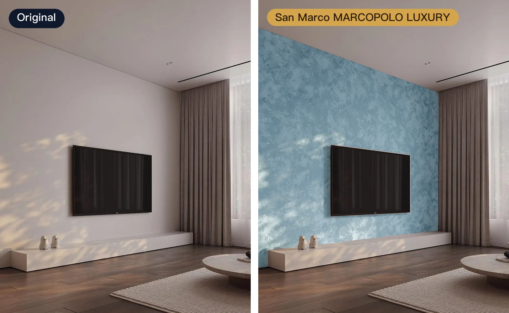
The wall on the right is MARCOPOLO LUXURY from San Marco, in the blue M053. It's a metallic paint with fine sand in it, brushed on by hand in a cloud pattern: swirl after swirl of sandy metallic sheen. That mix of grain, metal and hand-brushed pattern is exactly what a small color card can't print.
Why can't a color card show what decorative paint looks like?
Ordinary wall paint is one flat layer of color: pick the right code and it will look roughly like that. Decorative paint is built up by hand, layer by layer.
- Technique creates the texture: the same material looks completely different troweled versus brushed. A card usually prints one small patch as an example.
- Area changes the feel: a shade that looks right at palm size often reads darker and heavier across a whole wall.
- Light changes the color: daylight and warm evening light make the same wall look different.
- Metallic and pearl are the hardest: they reflect and shift with the viewing angle — something print simply can't reproduce.
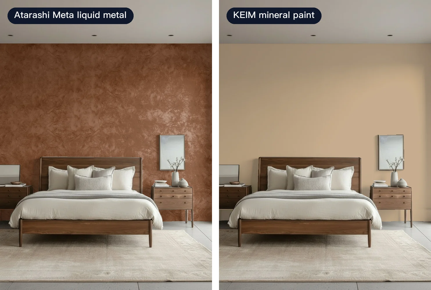
The finish matters even more. Here is the same bedroom headboard wall twice: on the left, Meta liquid metal from Atarashi in copper; on the right, KEIM mineral paint in a warm apricot with a mineral matte finish. One catches the light, the other stays quiet, and the whole room feels different:
How should you read a mineral or decorative paint color card?
Mineral paint is lime- or mineral-based. It dries matte, with a slight grain and hand-made variation — nothing like the even layer of an acrylic emulsion. That's exactly why its color card is the easiest to misread.
- Record the color and the technique together: the same color code looks lighter or darker with a different technique. Write down "this color + this technique," not just the code.
- Expect it to read darker: the card is the smallest possible area. If you're torn, go one step lighter.
- Look at it next to the actual wall: once in daylight, once with the lights on at night — not only under showroom lighting.
- Ask for a larger board or project photos: the texture on a card is a token patch. You need a bigger board or a finished wall to judge the pattern.
A common complaint about decorative paint is "it didn't turn out the way I imagined." Usually that isn't the paint's fault — the card was only ever meant to show color.
Why are physical sample boards so slow?
A sample board is the most accurate option: real material, real technique, something you can touch. It's also slow by nature.
- Mix the color the client chose.
- Apply it in the specified technique — some need several coats.
- Wait for it to dry — only then do you see the true color.
- Take it back to the site — if it's wrong, back to step 1.
The time isn't spent on one board. It's spent on the rounds of "change one thing, start again." Many of the early rejections could have been spotted on a photo.
What can an AI paint visualizer show?
A visualizer doesn't replace the sample board. It moves the "let me see what it looks like" step earlier and makes it instant, using a photo of your own wall.
- The whole wall: the texture is laid out at the wall's real scale, so it doesn't grow or shrink with how far away the photo was taken.
- Different techniques: the same color code can be viewed in different application techniques.
- The finish: pearl sheen, metallic reflection and mineral matte are shown with AI photorealistic rendering, not a flat overlay of color.
- Your light: bright and dark areas of the photo carry through onto the new wall.
TACTO from LUXUS PAINT is a good example: the same color can be applied in four techniques — skim, press, swirl and brush. Below is the same dining-room wall in the same gray, Y-102, skimmed on the left and swirled on the right. The texture and depth change completely:

There are things a visualizer can't show: the feel under your hand, small differences between applicators, how a metallic finish moves as you walk past. Those belong to the final sample board.
How close is the on-screen color to the real wall?
The biggest fear with decorative paint is "one color online, another on the wall." So RoomDreaming doesn't use catalog photos. When a brand is onboarded, we scan each physical sample board at high resolution and calibrate it to the real color reference.
Because every product goes through that scan and calibration, onboarding an art paint brand takes over a month. In return, every customer afterwards sees a calibrated color. Screens still vary, so always confirm on a physical sample.
What's the most efficient order?
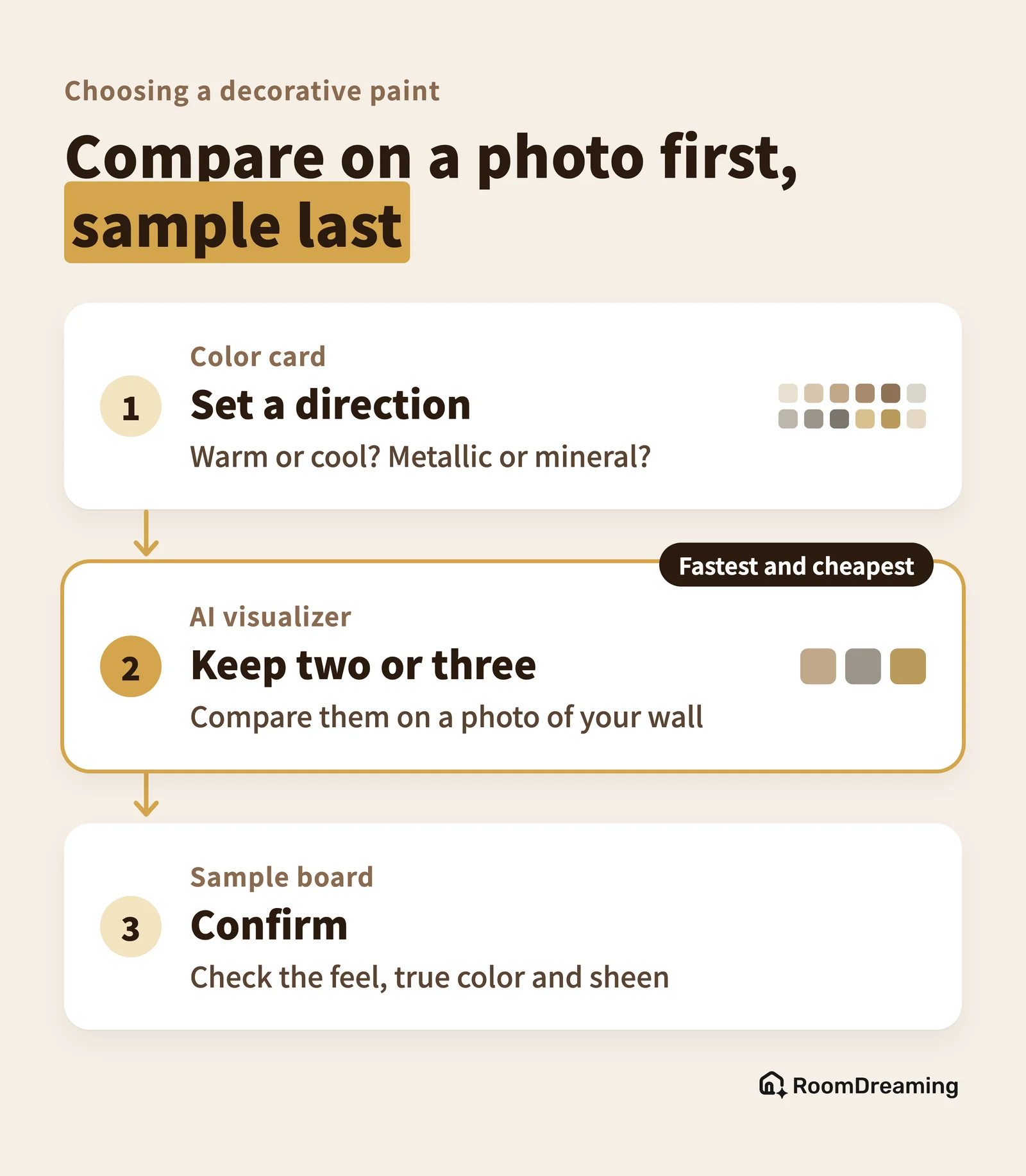
Give the color card, the visualizer and the sample board each the step they do best:
| Step | Tool | What to do |
|---|---|---|
| 1. Set a direction | Color card | Warm or cool, metallic or mineral |
| 2. Narrow it down | AI paint visualizer | Compare on your own wall photo, keep two or three |
| 3. Confirm | Physical sample board | Check the feel, true color and sheen |
Step 2 is the fastest and cheapest, and the earlier you do it, the fewer boards you make later. Several paint brands in Taiwan already offer it on their own websites — including LUXUS PAINT, San Marco, Atarashi and KEIM, all linked above — so you can try their colors on a photo of your own wall. Designers who want to build this into proposals can read how designers save proposal time with brand visualizers. For paint brands, the brand-side setup is covered in how art paint brands let customers try colors online.
FAQ
Can I choose a decorative paint from the color card alone?
We don't recommend it. A color card shows the color, but not the texture the technique creates, how it looks across a full wall, or how your room's light changes it. Use the card to set a direction, then narrow down with a visualizer.
If I use an AI paint visualizer, do I still need a sample board?
Yes, but make it the last step. A sample board is the best way to confirm the feel and the true color — it just has to be remade every time you change your mind. Filter out what you don't like first, and only sample the final two or three.
Is the color in an AI visualizer accurate?
When a brand is onboarded, we scan its physical sample boards at high resolution and calibrate each one to the real color reference. Every phone and monitor displays color a little differently, though, so confirm the final choice on a physical sample.
See it on your own wall first
To see decorative paint on a photo of your own wall, take a look at the RoomDreaming paint visualizer.
Try it on a photo of your own room
Upload a photo and swap in real products to see them in your space. No download, no sign-up.
Further reading
- How Decorative Paint Brands Let Customers Try Colors Online: Website, Sales Links and QR Codes on Color Cards
- Interior Design Proposals Taking Too Long? How Designers Use Brands' AI Material Visualizers to Save Render and Selection Time
- Can ChatGPT or Gemini Pick Your Tiles? AI Room Design vs a Material Visualizer